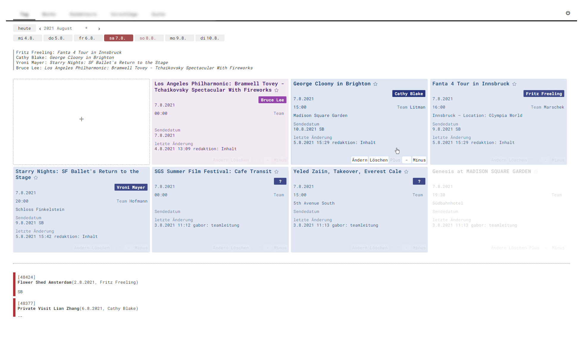
design forces
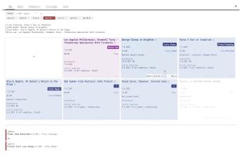
the established workflow centered around a huge physical board. design naturally departed visualising this board, a regular grid proved best after iterations.
producers evaluate many items against each other. dense presentation of items that expand on mouse click provide overview.
producers decide and act fast. hovering an item brings up buttons to start inplace editing. all pre production decisions are done on this single page. this aligns cognitive activity with the previous workflow at the physical board - the board always stays in front.
this is television, glamour and glory! avoided a typical 'database ui' with forms and lists. its not a game either, but tough production, so staid serious and practical. integrated corporate and program ci where possible.
other pages allow tv programming by drag and drop or ressource planning.

research center ffoqsi had graphic elements, visual corporate identity and visual web page design ready, when they asked me to finalize the design, implement and host the page and provide a way to update site content.
developers favor github pages and static site generators to get fast hosting, version control and ease of operation for free. i took the challenge to train ffoqsi personell this developer way of site maintenance.
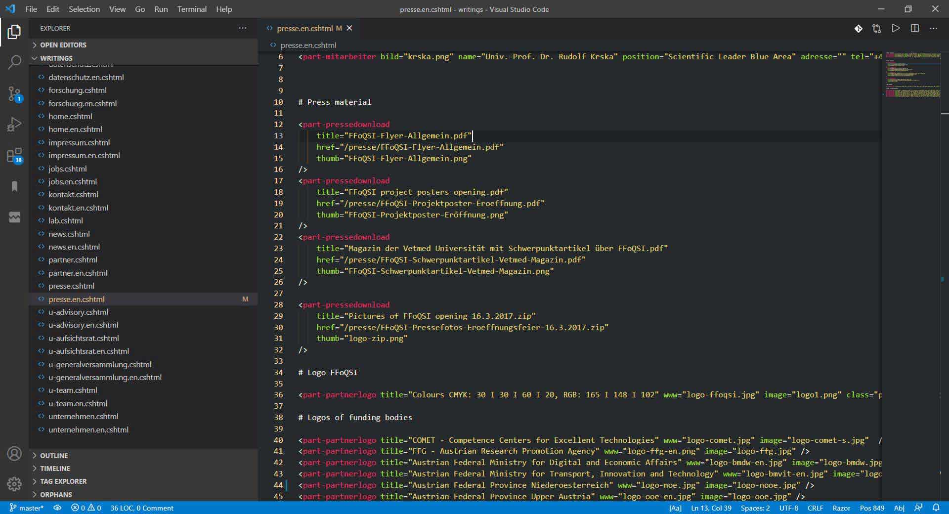
site generator
ffoqsi personell writes content in markdown. inside markdown they use components i prepared for them, for instance components for team members, scientific partner profiles or foto galleries. the site generator 'foxygen' serves an internal preview. with a single click, by fetching a bookmarked page, the preview is published to github.
all involved persons praised this tool as being better than systems they used before. static site gens apply beyond the developer community.
the implementation is based on razor view engine's tag helpers - components in tag form.
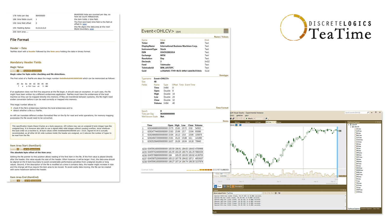
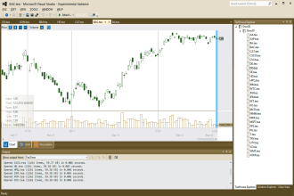
discretelogics provides tools for time series analysis and processing.
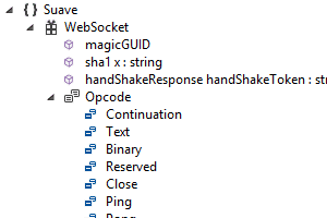
wrote the teafile file format definition and 3 platform agnostic open source apis for this file format in c#,c++ and python. unicredit italy released one for the nim language.
teahouse and teashell are windows applications, written in .net and wpf.
created all visuals like corporate logo, icons and the web page (with github pages + jekyll).
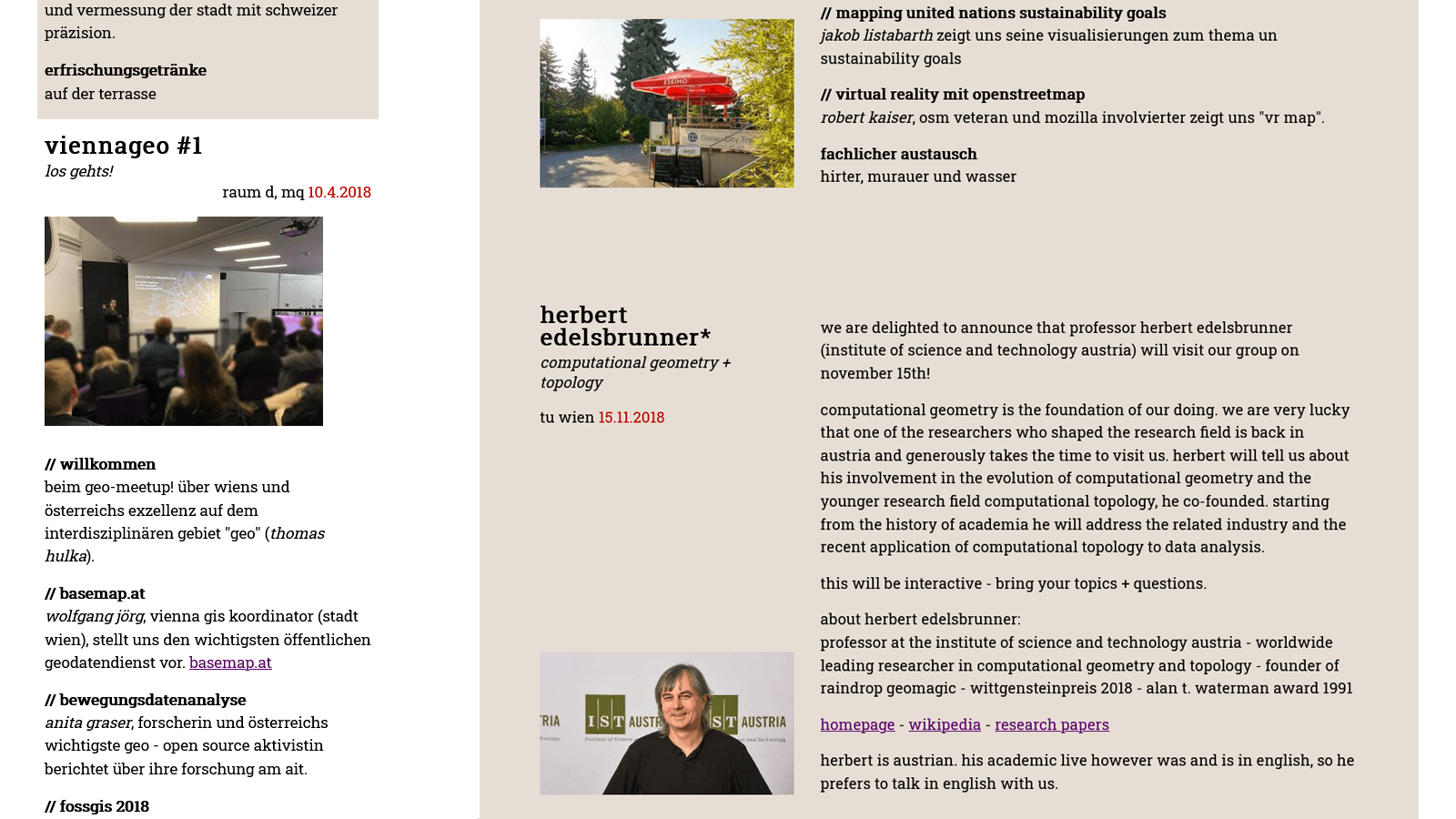
simple static web page.
the page has a lighthouse score of 100/100/100/100 for desktop and 99/100/100/100 for mobile. the 1 percent off is for the short (10min) cache intervals on images. lighthouse suggests a year. well, for now that 99 score does not force me to put the images onto another host. tough netlify might be a good alternative to github pages.
website (best on mobile phone)
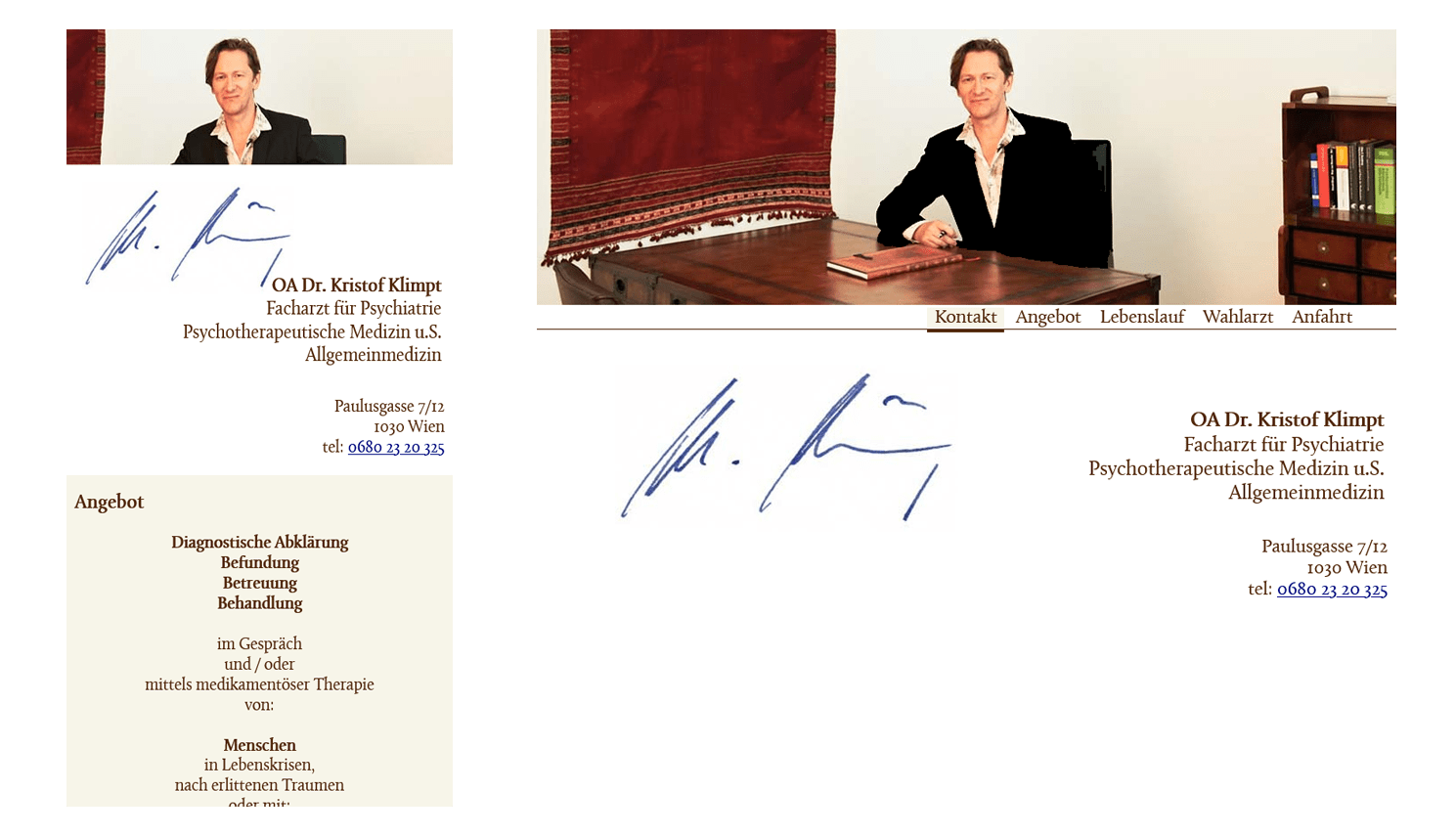
use case
the user gets the name of the doctor, is located in the train or at home, wants to inform herself and then call.
design
- mobile page loads in a single fetch
- on desktop shows animated page transitions
- can call directly: href="tel:0680 55 55 555"
- google maps entry
did not use lighthouse during development but still has 100 / 92 / 93 / 100
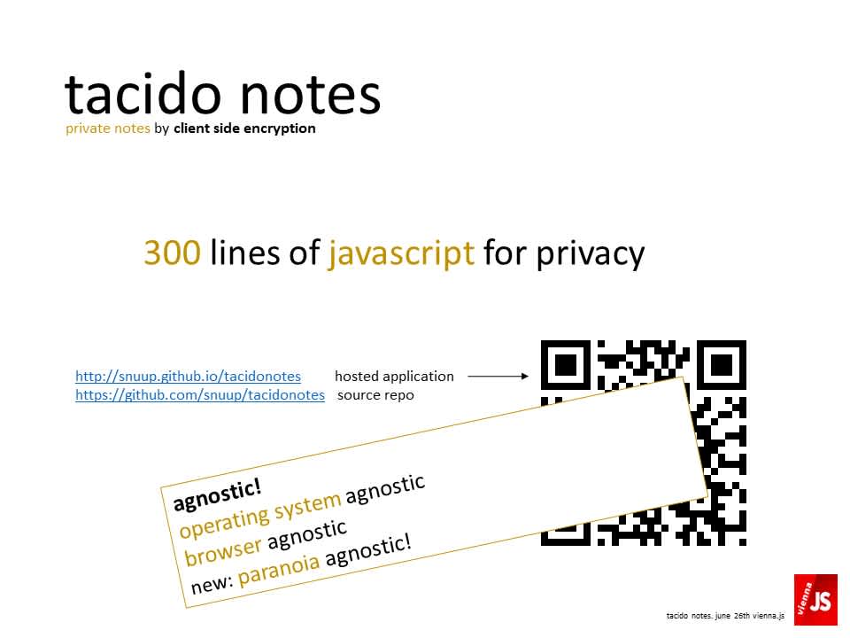
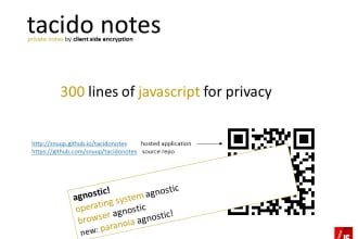
client side encrypting note taking app. built with
- drop box js api
- stanford javascript crypto library
- contenteditable - i believed in this technique for a long time
- typescript (use it since 0.8)
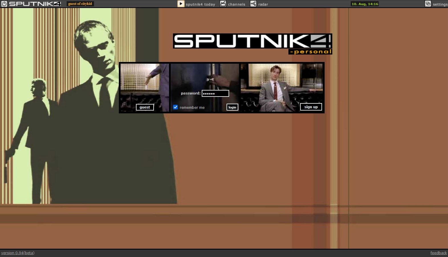
a universal recommendation service, started with events in london + vienna
programmed in c# and c++ with in memory processing for results within 1 millisecond.
here the skin for london ...
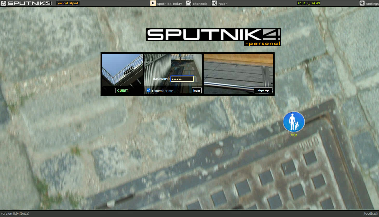
... and here the skin for vienna
i always found skeuomorphism in screen design too dominant, underestimating users. the 5 buttons in the header are the only slight skeuomorph elements, justified as a contrast to the remainung ui, which was flat. this was in 2003, many years later flat was is en vogue. same with the large fotos that set the mood here.
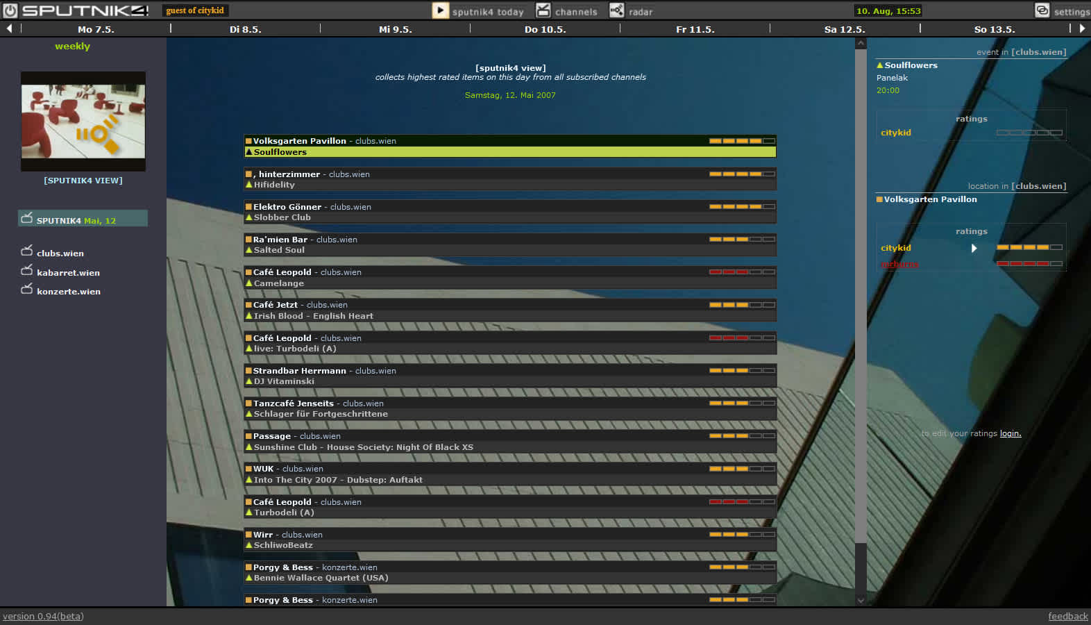
users read recommended events based on their own ratings and the ratings of selected other users.
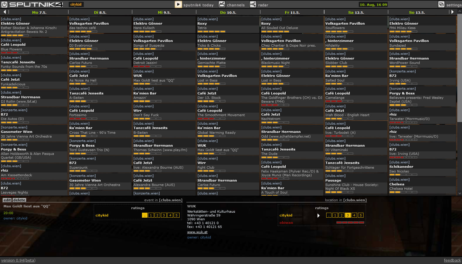
the weekly overview
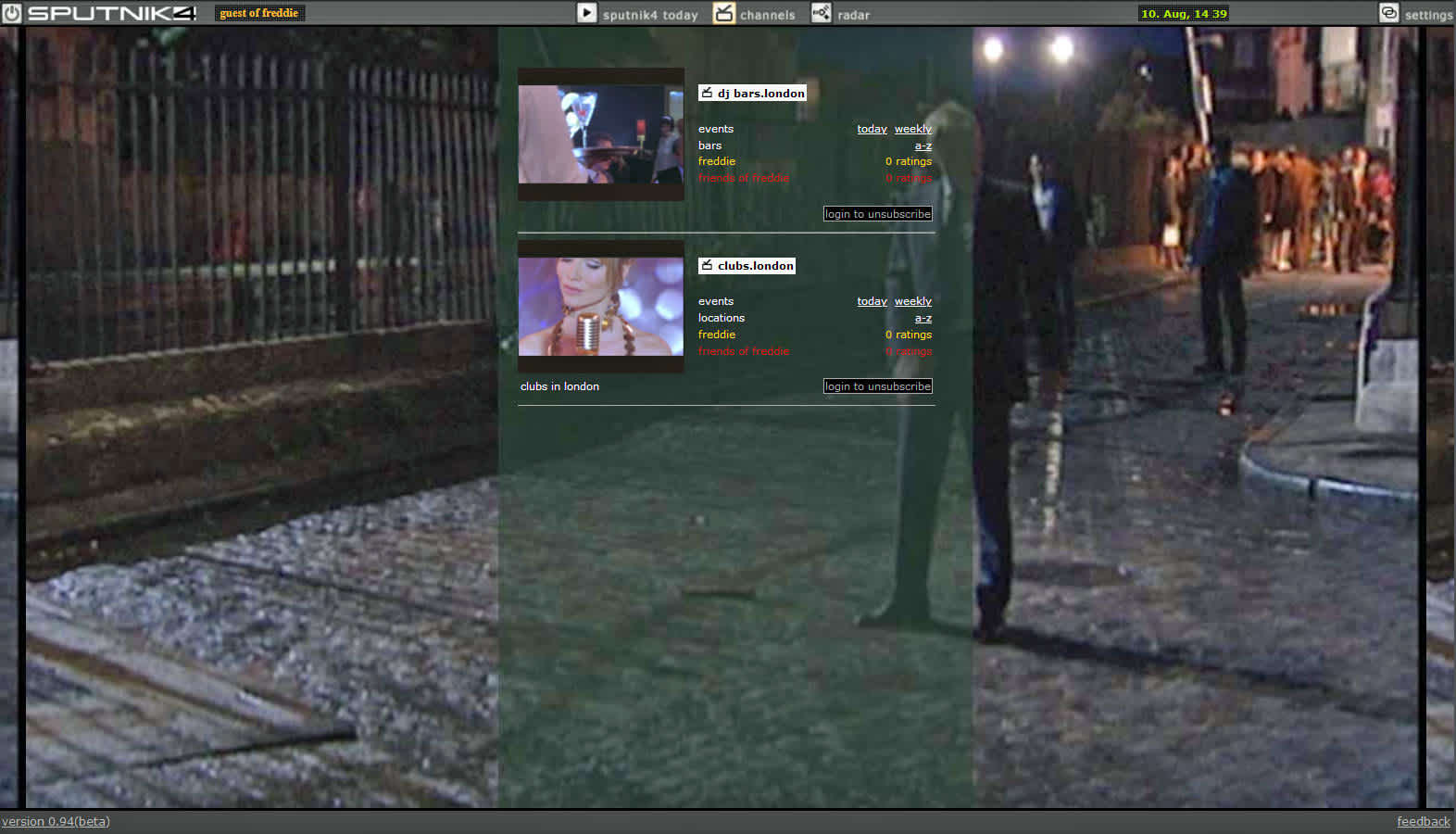
channel selection - similar to newsgroups
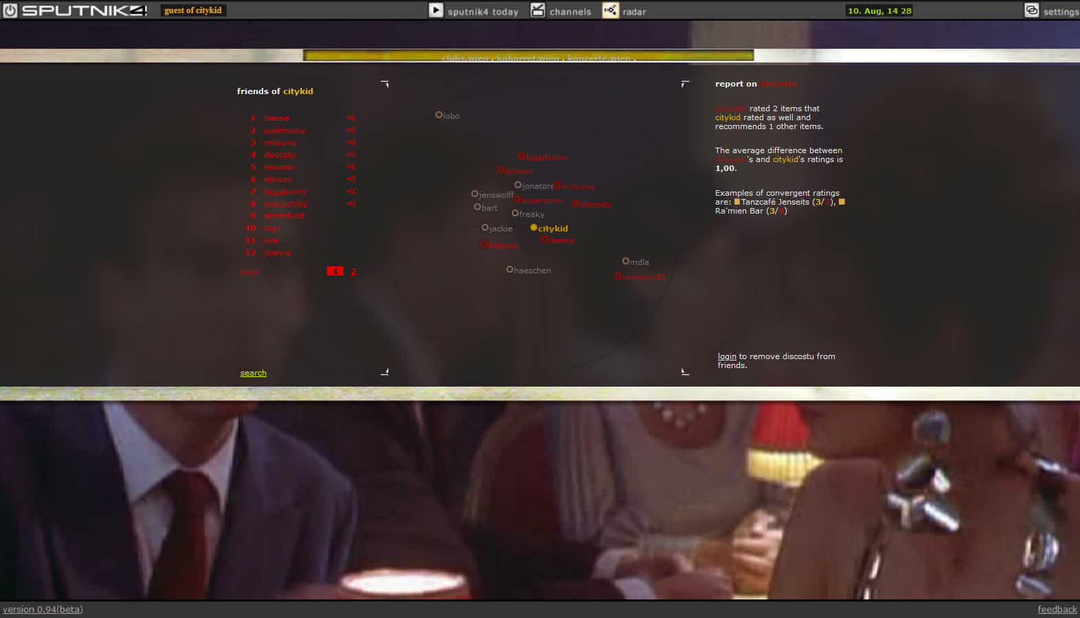
users find likeminded users with similar ratings ...
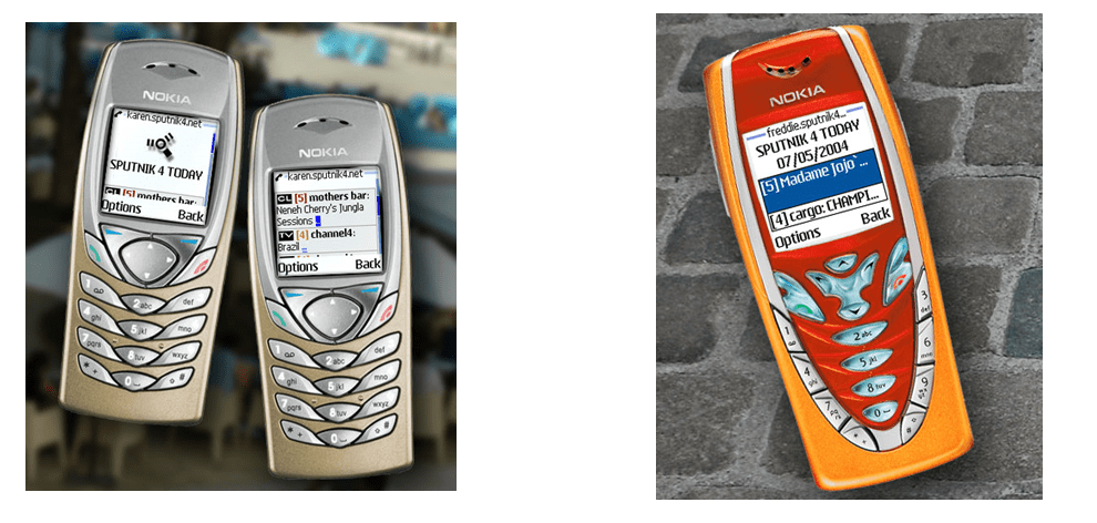
and use the service on their mobile phones.

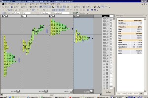
implemented the realtime quoteboard (model and view), the realtime news feed and, most challenging, the ...
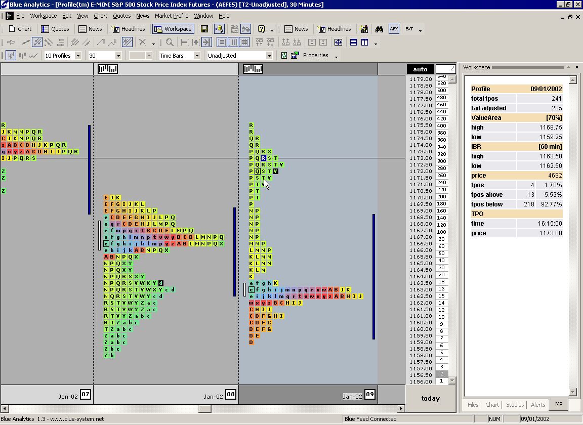
marketprofile, with hover and selection features on every element and
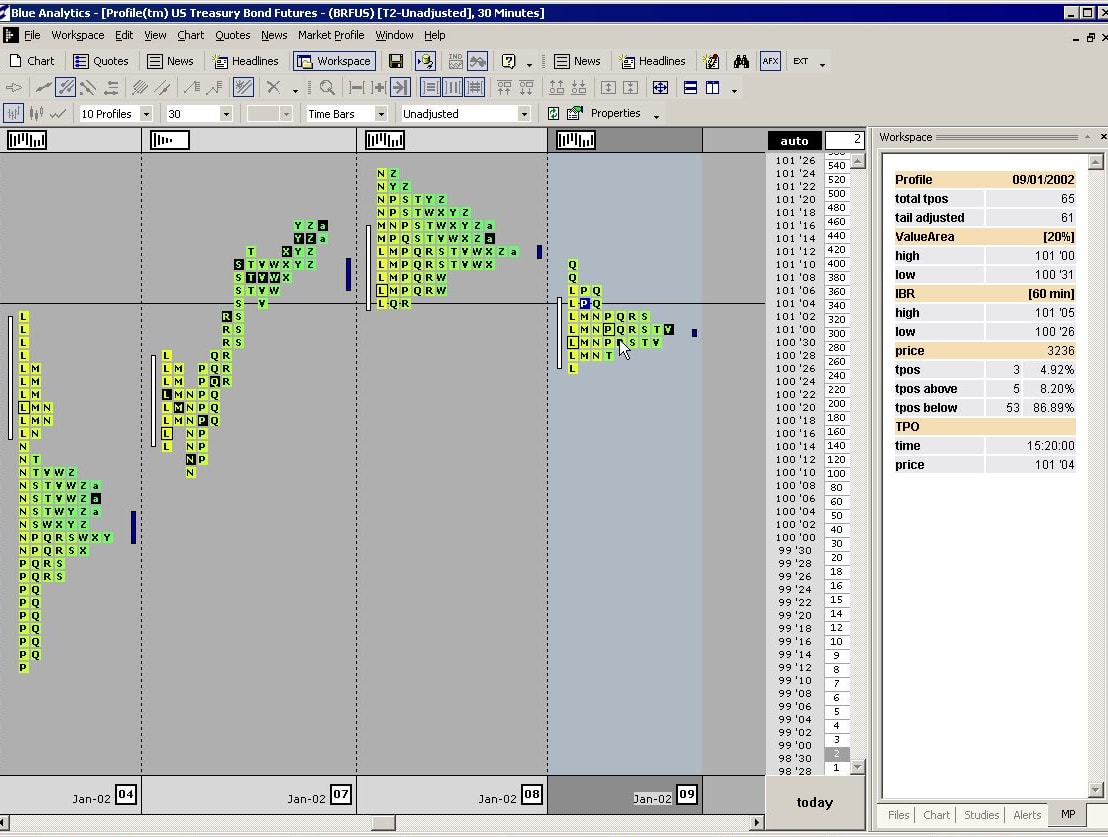
fold / collapse per day.

the rhodes chroma synthesizer - cult.

i lived inside it while builing a midi interface for it.

- soldered parallel hardware interface for commodore vic 20
- soldered serial midi interface for commodore vic 20
- developed software with vic 20 using raw 6502 mnemonics
- transferred hard- and software to a rockwell 6511eab singlechip microcontroller
- integrated the controller into the synthesizer

lets end with another picture of this wonderful synth.
| previous slide | swipe, mousewheel, scrollbar | left-arrow |
| next slide | swipe, mousewheel, scrollbar | right-arrowenter |
| first slide | scrollbar | pos1 |
| last slide | scrollbar | end |
| close gallery | close-button (top right corner) | esc |
| toggle explanation | click or touch page | space |
